Introduction: Laser Cut Butterfly World Map


The world maps we see in most contexts - the Mercator projection - don't really represent the land masses of earth accurately at all. One of my colleagues sent me this clip from the West Wing that sums it up pretty well.
I'm a big fan of Buckminster Fuller, and his idea for a world game, where people would work through global resource challenges on a world map board. Buckminster Fuller designed the Dymaxion Projection that displays all continents without major distortions like the Mercator projection.
I've been a fan of this map for years, but the other day I stumbled upon something even better.
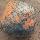
While looking through maps of the Port of San Francisco at the Prelinger Library, I came across a beautiful map that offered the same flattening without distortion, but maintaining symmetry and a regular grid. The map in question, and pictured above is the Cahill Butterfly projection (amended as the Cahill-Keyes projection thanks to the contributions of cartographer Gene Keyes).
Both Keyes, and Wired Magazine have weighed in on the benefits of the Dymaxion map vs. the Cahill projection, and both have decided that the Cahill map is a better, more legible projection.
I have really fallen in love with this map, and would like to use it in my projects moving forward, so I worked to make a laser cuttable version of it.
Step 1: Create Laserable Geometry

Gene Keyes, along with his partner and programmer Mary Jo Graça, created a digital version of the Cahill-Keyes world map. A Perl script is used to import GIS data, which created accurate shorelines and national borders.
While his website can be a little confusing, you can find the latest map prototype and information about its development here.
There are several PDFs, at different sizes that can be downloaded from Keyes' website. However, for my purposes, there is simply too much geometry. The shorelines were all drawn as partial vector lines and points, which would take far too long to laser cut.
I ended up isolating the land masses in Illustrator then importing them to Photoshop to colour in. Once I had black land masses, I imported them back into Illustrator and used the tracing tool to get clean vector lines.
This is an imperfect system. In my haste to try this out, I eliminated a lot of information, simplifying shorelines and removing small islands. I would like to go back and do a more diligent job now that I have made a prototype.
Step 2: Cut That Map!

In order to keep the time creating this down, I did all of the etching with light vector lines. The piece I made measures around 36x24", so raster engraving would take a really, really long time.
The file I cut is included, with each different operation (outline, grid, land masses) as different colours.
Attachments

Step 3: Finish Your Piece!
I used 1/8" plywood to cut the map out, but after laser cutting, I painted it with watercolour paints and redrew the grid with acrylic paint markers. I think it's important to finish your laser cut pieces, it's just one tool in a large vocabulary! This did, however, take me over 5 hours to finish.
From here, I intend to create a more detailed version that can be CNC routed into high quality wood, and develop a method for mapping additional GIS data onto the map. More soon!