Introduction: How to Make a Reference Sheet


Hello, everyone! As many of you know, I like to write and am currently working on writing a book titled "Wildcat". In this book will be illustrations in a, well, I wouldn't call it manga, but manga-esque style. To be consistent with my characters and their coloration, I have made what is known as a reference sheet. This sheet will help me out if I forget how a particular marking looks or what colors I need. Many reference sheets are very complex and look more like an architect's notes than anything else. If your character is very complicated, I do recommend drawing at least two opposite views of the character. However, with this particular character, Dusk "Dusky" Castell, who is based on my real life canine companion, Jake, the design is pretty simple and straightforward, so only one view is needed.
If any of you were wondering, Jake is the dog in the second picture. He is (most likely) a Border Collie/Labrador mix, and he is a really great (though currently in training) dog!
Programs Used:
GIMP (dog)
Photoshop Elements 13 (background)
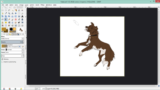
Step 1: Sketching

I don't usually do my sketches on the computer, but for those of you who do, here is what it should look like. If you choose to do only one drawing of your character, make sure you can see all four legs.
Step 2: Lineart


For this particular picture, I used a 2.5 pixel hard brush, occasionally lowering it to a 2 pixel or a 1.5 pixel brush for the fine details. As far as dynamics go, I used a custom brush dynamics setting, which, in the dynamics matrix, has the size and opacity boxes checked under fade and velocity.
Step 3: Coloring


The coloring is usually fairly easy, but can be a bit time-consuming. Fill it in with solid colors. Shading should be minimal or not at all so you can more easily see the colors. Using the gradient tool is great for reflective surfaces such as the tag on Dusky's collar. You can use the free select tool or the fuzzy select tool to color it in more quickly. Generally, I do all of my coloring on one layer except for the iris and pupil of the eye, which have their own layer.
Step 4: Background

The background I chose for this particular drawing is a very simple one I'd made not long after I was so graciously given Photoshop Elements 13. It was just something I'd done to familiarize myself with Photoshop, but I believe it works very well for this. Unfortunately, I didn't document the process with screen captures, so this portion isn't very well documented.
To make it, make three or four new layers. The one furthest back should look the furthest away, so use a smaller brush for the grass. The one closest should have larger looking grass. You get the idea.
For the sky, fill the background layer with blue. Make a new layer over the sky but under the grass. Use this to make the clouds. For easy clouds, go to filters>render>clouds, then set the mode to screen, which omits the blacks, but shows the whites. Blur this layer if you would like it to seem distant. For the trees, use the leaf brush to make tree-like blobs on the horizon, then blur them out.
Again, sorry about the lack of pictures...
Step 5: Finishing Up

It wouldn't be much of a reference sheet if it didn't have a color palette, so use the eyedropper tool and the paintbrush tool to make one. You need to include every color you use for the fur, eyes, and any accessories your character might have. This includes, but is not limited to, collars/collar tag, bandannas, bows, and legwarmers, just to name a few of the more common ones.
You will also want to put a little about your character as well, so that you don't forget how he/she acts. This is especially useful for characters you have just created.
Step 6: Traditional Reference Sheets Vs. Ref. Sheets With Scenes


Most reference sheets, like the one of my main character, Ember, have a mostly solid background with lighter or darker rectangles around different sections of the sheet. While this does look sleeker, it can be refreshing to do something a little different every now and then. The biggest difference between the two (other than the background) is that with a traditional sheet, it still looks good when you zoom in on a distinct feature, like Ember's scarred paw.
And yes, for those of you who noticed, my style has (finally!) gone from a spin off of someone else's to a style of drawing of my own, I'm happy to say. One thing every artist ought to do is come up with their own unique style. Your style is like your signature, someone should be able to look at it and tell that it is something you have done. This goes for all kinds of art, from realism to abstract: the way you draw can define you. Now, if you are worried about it, I don't at all mind if any of you copy or branch off from my style. In fact, the drawing you see above are still heavily influenced by others. This is just an artist-to-artist tip that I wanted to share with you.
As always, have fun and keep on makin'!