Introduction: The Great 'Snapchat' Experiment


In this experiment we will be looking into the mobile messaging application 'Snapchat'. We will be using a survey to see if there is a connection between nationality, sex against how many 'Snaps' were sent and received. We will also be looking at the connections between 'best friends' in 'Snapchat'. This Instructable will show you a detailed recount of how we performed this survey and what we did with the data.
Step 1: Background Information on Snapchat

Snapchat is a photo messaging service which was founded in 2011. This service gives users the opportunity to send photos and videos to friends. The photos and videos sent can only be viewed for a short amount of time, between 1 and 10 seconds. On Snapchat every user has a score which is added up by the amount of 'snaps' sent and received, users also receive a list of there 3 'best friends', these are the 3 people that you receive the most from and that you sent to the most.
Step 2: Making a Plan
For this experiment we are trying to see a connection we decided to ask the following questions and we hope to solve and find out.
1.Which gender uses 'Snapchat' more
2.Which nationality uses 'Snapchat' more
3.Do people receive or send more 'Snaps'
Step 3: Making the Survey

As I said in the previous step we made our survey using Google Drive, this was a very useful tool since it allowed my team mates to work on the survey whilst I was to. It also made it a lot more easy to share (we could have shared it through social media but people tend to write bad words in place that they can). Below are some images and a link to the finished survey.
1. Questions
Decide what questions you are going to ask, we asked for name, age, snaps sent and received (and how this can be found), there 3 best friends and their relationship to each of these friends.
2. Stopping spam
After we asked several people to do the survey over Facebook, this went terribly wrong since we got several answers, even tough it did contain the asked information, were highly inappropriate. Some of the cleaner ones were "124 nudes and counting" or "43 potatoes" these made us take extra time to delete any swear/unnecessary words. After we sent it out on Facebook we decided to stop this from wasting our time, so we added rules to the survey. This made it possible to ONLY have whole numbers as an input. In the below pictures you should find a picture with the settings that I used to do this.
3. Confidentiality is key
In this Instructable we were not able to add any information about who is dating who in my school or the best friends list since this would be against some law and I personally would away getting sued. So remember when doing your survey DON'T ask for personal information ONLY if you have permission to use it.
Link to the survey
Step 4: Carrying Out the Survey

The next step is to get the sample (or if you decided to do a census, a census) that you have chosen to fill in your survey. If you want to you can throw the survey out on social media platforms to get a bigger sample, but remember if you have different amount of genders/ nationalities/ages you will have to do lots of averages. Anyway we always monitored the people who were carrying through the survey so that no false information was given.
Step 5: Data Visualization


So, now that we have collected all our data we have a kind of excel (Google charts to be exact) chart that we could use to make some graphs, but I tried out Plotly which was a great place to analyze and visualize our data. If you want to you can use Excel, Google charts, Numbers or any other software that tickles your fancy.
Step 1.Central Tendencies of Data (averages)
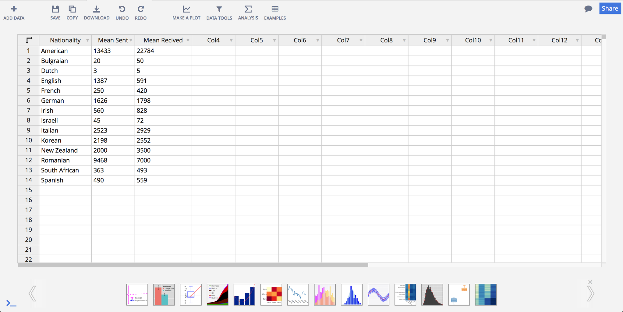
First of all we copied all of the information we had from the Google docs into a plotly spreadsheet. To do most of our charts we had to use averages, the mean is the most commonly and widely used type of average. We averaged the mean of Snaps sent and received per nationality (picture 3) afterwards we copied this information into a plotly spread sheet.
Step 2. Data Visualization
Now we get to the fun stuff, we will be making 2 graphs a heat map for nationality and a scatter diagram for gender. Lets start with the heat map, we went to our spreadsheet with the mean sent and received from each nationality. Then select as shown in picture 4 heat map and in picture 5 to select the nationality column as y axis and the mean sent and received as the z. Then you should get something like in picture 6. These colors all look quite the same so lets change the colors. I did this by clicking on traces and then style. I used the rainbow gradient since it looked the best and you could see the biggest difference between the smaller numbers. The final graph is visible in picture 7
Link to the Heat-map!
Step 6: Data Visualization Continued


Step 3. Graph 2
Now we will make the scatter graph of snaps sent and received depending on gender. First of all open the spreadsheet as shown in picture 1. Then select scatter plot. Then as shown in image 3 chose snaps sent as the x (or the y it does not matter) and snaps received as the y. Then click on Group by and select the gender as G. Now click on scatter plot and your graph should look like the one in picture 4.
Step 4. Line of best fit
Nowwe are going to add a line of best fit we do this by clicking on fit data button (as visible in image 5) and then "Add fit to this trace" then just use the default equations and the line should pop up and look like the one in image 6.
Step 5. Titles
To finish this graph off lets add some labels and titles. After you are done it should look like picture 7.
Link to the Graph
Step 7: Summerizing
The final step is to summarize the information this is what we got:
1.Girls send and receive more than boys no matter how long they have had the application
2.Both genders receive more than they send
3.Boys that have girlfriends receive more than they send
4.Barley anyone 'snaped' with their family members
5. Americans and Romanians send and receive the most 'snaps'
Areas of improvement
1.Ask more people
2.Make ratios
3.Ask people in other grade levels
4.Put the survey on social media.
5.Make some cool charts with the best friends (e.g. friend web)
Thanks for reading!

Participated in the
Data Visualization Contest