Introduction: WebPlotDigitizer, Styling Graphs & Plotly

In the midst of your research project on American Productivity and its Relationship with Wages, you stumble upon a less-than-inspiring graph; however, it supports your argument: it is a simple yet bland line graph where the lines are the exact same color, blurry and just looks like it was designed on your grandmother's 2005 TracFone.
You'd like to use the data from the graph to support your research...but you don't have access to it; moreover, you refuse to use the rather ugly graph you stumbled upon.
Problem? Nah. WebPlotDigitizer (data extraction), Plotly, and a little artistic flair to the rescue...!
Step 1: Take a Screenshot of the Original Graph

You'll need a clean version of the graph. Lines and other graph features should be clearly visible. This is critical to an accurate data extraction.
Step 2: Head Over to WebPlotDigitzer (http://arohatgi.info/WebPlotDigitizer/app/)
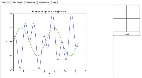
The next step in the process involves extraction of the data on the graph. Enter: WebPlotDigitizer. It is a simple yet effective tool that allows you to pull data from just about any chart on the web. The interface is a breeze to work with but I'll step-by-step you through it regardless. First move? Drop your graph/chart/plot (must be an image file: .jpg, .gif, .png, etc.) into the app, just as it says!
Step 3: Define Your Axes

After dropping your image into the app, it should instantly appear in front of you. The next step involves giving the app information about the graph's axes.
You'll want to hit the "Define Axes" tab on the top of the app (1)
select 2D (X-Y) Plot (2),
Align Axes (3),
and then Proceed (4).
If you've done that correctly, your graph should once again be front and center and your mouse pointer now a cross-hair as you run it over the graph.
We will now align the x-axis; to do this, click any known point toward the bottom of the axis (say, 1950) and another toward the top (say, 2010). Be sure to get your cross-hair aligned as closely as possible to the graph ticks before you click.
If that was done right, you should see two small blue circles on the graph, one at 1950 and another at 2010.
You'll want to do the same thing once more, but this time for two points along the y-axis. I'll pick 50 for my bottom point and 150 for my top point.
Once you select both points, the "X and Y Axes Calibration" screen should appear. For the x-axis fields, input 1950/01 for point 1 and 2010/01 for point 2 (/01 for January of 1950/2010 ~ WebPlotD is smart with dates!). For the y-axis fields, input 50 for point 1 and 150 for point 2.
When you are done, hit "OK."
Step 4: Acquire Data!

Once you've successfully defined your axes, you are now ready to pull the data out of the chart. Now, you'll want to select "Switch to Auto" along the right panel of the app. After this, select "FG" for "Foreground Color." Something will pop up -- select "Color Picker."
The pop up should disappear and your cross-hair should be back. Next, you will want to place the cross-hair along one of the lines; let's choose the "Productivity" line first. Make sure the cross-hair is on a portion of the line, and then click. This will specify the foreground color; when I do this, I receive an RGB value of (58, 58, 58). Yours may be somewhat different depending on which portion of the line you clicked.
Now that WebPlotD knows what color you are looking for, you are now 100% ready to pull the data.
Select "Pen" on the right panel (1)
Since the line you are pulling data from is thin, notch down the stroke width of the pen (do this at the top panel of the app) (2)
Begin tracing the Productivity line on the graph; the line should become yellow as you draw over it (3)
Go all the way to the end of the line at the top of the graph; utilize the zoomed window at the top right of the app to be precise (4)
When you've finished tracing the line, click "Extract!" on the right panel. Fine tune the graph so that the line is close to solid. You can do these by playing with the "Color Distance." I used a color distance of 120 in my example. After this, hit "Get Points."
Finally, click "Create .CSV" along the right panel and select "Graph in Plotly." Once you do that, Plotly will load with your line, front, and center!
Wash - rinse - repeat for the "Median Family Real Income" line.
Step 5: Starting With Plotly

Once you complete the extraction process, you should have two Plotly windows with a line graph in each. In order to consolidate them, lets select "VIEW DATA" in Plotly; do this for both of the graphs. Copy the data from one of the graphs, then create a new grid in Plotly (+ NEW: Grid) via the top panel. Save this as whatever you'd like; I named mine "Economics." Then, copy the data from the second line into the same grid. You should now have four columns of data in front of you!
Step 6: Making a Plot

Now that you have all your data in front of you, click "MAKE A PLOT" and select "Line Plots" along the Plotly top panel. The first column should be the x (dates) in blue, the second y (index), the third another column of dates in orange, and the fourth another index column. Once all four are selected, click the blue button on the left that says "Line plot."
Voila! There is your graph, and it already looks a heck of a lot nicer than the original and you have even styled it yet.
Step 7: Styling Your Graph

How you style your graph is ultimately up to you, however I'll pass along some tips and show you my final edition.
If you aren't familiar with Plotly, I suggest that you explore all the styling menus at the top panel: Traces, Layout, Axes, Notes, and Legend to see what's what...
My first step was to shrink the size of the graph - think tall, not wide, so that the data spreads out. In the Layout menu, I made my width "700" and Height "550." While we are here, lets take a peek at the fonts. Among the Plotly selection, my personal favorite is 'Georgia.' It is a sophisticated font that is easy to read and not too large or small. Let's also change the font color from pure black to (33, 33, 33) -- a steel color that isn't as harsh on the eyes. Feel free to play with the Plot Color if you'd like; I kept mine the default white. Inside the "Margins" tab, turn your Plot Padding to 0. This eliminates unnecessary space and makes your graph look more professional.
We can now move over to the "Axes" tab. First step, select "X Axis" in the drop down menu and head to the "lines tab." I suggest turning the axis line off and the mirror off. This has a freeing effect on the graph and removes the semi-ugly black encasement. I also turned my X Axis grid lines off; Plotly's interactive display eliminates the need to keep them. To the Y Axis...you can turn the Axis Line and mirror off here as well. I kept my Y Axis grid lines on.
Now head over to the "Ticks" tab. You can select "All Axes" in the drop down menu; turn all ticks off. Since we removed the axis lines and mirrors on this graph, ticks are unnecessary. Your graph now looks more professional!
Let's zip over to the "TRACES" tab. Hit the "Style" tab. Plotly has awesome default colors. Select your favorites.
Lastly, hit up the "Legend" tab. I suggest making the "Background" and "Border" opaque (move color slider all the way to the left). You can also make the legend background a color that complements the lines of your graph. In this case, I chose to make my background a light grey to create contrast.
Be sure to title your graph, axis, and legend. Cite your source!
That's it! You have an awesome graph now and the data from the original is forever freed!

Participated in the
Data Visualization Contest