Introduction: Create a Header for Twitter With Photoshop
Ever wanted to create a banner for twitter? Today we'll teach you how to create an eye catching graphic for your twitter page using Adobe Photoshop CC.
For this project, you'll need at least 1 picture of your choosing. It can be art, a photo, whatever you would like. Keep in mind that text will be going over your image. I use 4 pictures in my project to show a technique called Masking. You also will need Adobe Photoshop. Most of these tools are in CS6 and later, such as the embedding, but you can also use the copy/paste method for images.
Objectives
- Embed images
- Use masking tools
- Use of text tools
- Use of layer styles
- Saving for web
Step 1:
Here’s the template we’ll be using. As of July 2015 this information is still accurate. Note that the profile picture is included. Any graphic content in the banner will be behind the profile image, so keep that in mind when thinking of your layout.
Attachments
Step 2:
Content in the gray area will not always been seen on all devices. It’s good practice to have your main content within the Content Safe Area, such as Name, Company Name, or any information you would want others to see in your twitter banner.
Your profile picture will overlay here. Keep this placement in mind when you are creating your main content graphic.
Step 3:
First, turn off the layers with the content safe information by clicking the eyeball next to the layers in the layer pane. We’re not going to be using these layers.
For now we want to keep the border showing the non safe area so we know where to put our graphic.
You can keep the Icon Info open if you want to make sure you don’t have text covered by the Profile Picture.
Step 4:
Now select the Text Tool in the tools panel on the left side. You will have options to change the font type and size. Select these before you begin typing. The font I used was Rockwell Extra Bold for this graphic and the size is 26 pts.
Type out a name, company name, or whatever you want to be the focal point of your text. This is going to be the first thing viewers to your twitter profile notice.
Step 5:
Now we’re going to do something called a layer style. Double click on the layer you created with text. It will open up a new window for layer styles.
I added two effects to my text that you can see below, a drop shadow and a stroke.
A stroke will add a border to your text. By default it’s set to 3 pixels, which is fine. I made mine a little smaller and set it to 2 pixels. The second effect adds a shadow on your text. You can use the angle option to change the direction the shadow is going.
After making the adjustments you have the option to add a subtitle, if you desire, under the main text. I used a different font, made it smaller, and added it on the right side. That way my font wont be covered by the icon on the left side of the graphic.
Step 6:
So far so good! But it’s looking a little dull right now. Let’s add some pictures to our graphic to make it more eye catching! Go ahead and click the eye for the border layer to hide it. We've gotten our text in the content safe area so we don't need to have it turned on anymore.
Step 7:
Time to embed some pictures. Embedding a photo takes up less file space because instead copy and pasting data, it’s linking to a file in another location.
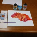
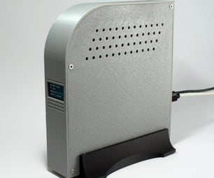
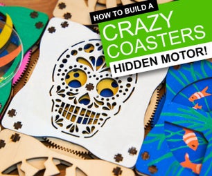
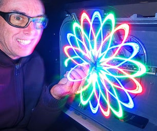
Click on ‘File’ and scroll down to ‘Place Embedded’ and locate photos or pictures you would like to include. For my project, I am using some pictures from some cool projects I found on instructables.
Layers are created for each image that is embedded into the document.
The layers are named after the image’s file name. They can be renamed by double clicking on the text for the layer to organize them better.
Here are the links for the instructable projects:
https://www.instructables.com/id/How-to-3D-Print-St...
https://www.instructables.com/id/Shandy-Recipe/
Step 8:
We now have a lot of pictures in our layer panel. So let’s tidy it up!
Create a new folder by clicking on the folder icon. Double click on ‘New Folder’ and rename it to ‘Pictures’. Drag all the image files into the Picture’s folder to keep them better organized.
Step 9:
Position your image or images across the document. If you’re only using 1 picture, you can skip the step about masking. The information is still pretty useful for future projects.
I’ll be using several images, however the placement doesn't look too pretty right now. We’re going to fix that by blending them together and using some basic masking tricks. But first we’re going to quickly lighten up our photos so it’s easier to see our text.
Step 10:
Since we created a folder for our pictures, there’s an easy way to change the opacity on them to make it easier to see our text. Click on the Picture’s folder and look for the option for Opacity. By default it will be 100%. I changed mine to be 60%. You can make yours any opacity you desire. The lower the opacity, the less opaque your photos will be.
Step 11:
Time to use the mask tool. The mask tool is used to make areas in a picture transparent. It looks like it’s being erased but it’s only adding a mask over the image. Use black to add transparency, use white to make an image opaque again. To use this tool, click on one of the layers with your pictures. Then click on the square with a circle in it at the bottom of the layers panel. It will create a white box for your layer.
After creating the mask, use the paint brush tool to paint areas you want to be transparent. Remember, make sure to use the color black. On the right you can see an example of the masking tool in use. Do this step for all images you have chosen to use. You may need to readjust and play around with the placement to get your desired look.
Step 12:
Here’s how mine ended up looking.
I used a mixture of soft brushes and hard brushes to remove the backgrounds. A harder brush will give more accurate edges while a softer brush allows for more of a blur. Also note that you can change the size of the brush, sometimes you need a smaller brush for accurate brushing.
Step 13:
Time to add the finishing touches to our graphic. Create a new layer, make sure this layer is directly under the layer where you have added your text. This layer will rename it self. On the tools panel, click and hold the Rectangle Tool. It will give the option for the Rounded Rectangle Tool. Click on that. Make sure you use a light color. I’ll be using white.
Click and hold your mouse a few pixels above and to the left of the first letter of your text, then drag it down to the lower right. This will create a rounded rectangle around out text.
Step 14:
Like we did earlier with the text, double click on the rounded rectangle layer to open the layer style window. Give it a border by choosing stroke.
And just as we did earlier with the folder of images, you can lower the opacity of the rectangle. The graphics in the back are still seen but now makes the text pop even more.
Step 15:
For our final step in photoshop, we want to save our image for Twitter. Click on File and look for the option Save for Web.
Make sure to save the file as a PNG for the best quality image. In the bottom left you can see how big the image file is. My picture is 841 KB. Not too big, but not very small.
I could change the image to a GIF but there would be a loss in quality. The other option is a high quality JPG image. After you’re done press Save and choose a location to save your finished file.
Step 16:
Go to your twitter profile and click on the button that says ‘Edit Profile’. This gives you the option to edit your header banner and your profile picture.
Click on ‘Add a header Photo’ and locate the banner you created in Photoshop.
Step 17:
After you have uploaded your image, you have the option to expand it to make it fill up the header. Because we used the proper dimensions, 1500 x 500 pixels, it will fit just fine.
Once you’re all finished, click on ‘Apply’ and you will be all finished. Enjoy your new twitter profile!

Participated in the
Graphic Design Contest


