Introduction: How to Draw Rendering: for Makers
This instructable will cover the basics of adding shadows and dimension to drawings as well as some basic rendering techniques.
The previous Instructables in this series covered the basics of selecting drawing tools, drawing posture, making a straight line, and drawing in 2-point perspective.
Here are my other drawing Instructables:
https://www.instructables.com/id/How-to-Draw-For-Makers/
https://www.instructables.com/id/How-to-Draw-Perspective-For-Makers/
https://www.instructables.com/id/How-to-Draw-Perspective-II-For-Makers/
https://www.instructables.com/id/How-to-Draw-Constructing-For-Makers/
Step 1: Casting a Shadow
The easiest way to cast an accurate shadow from a simple figure is by dropping the top face of the figure to the ground plane and shifting it back as long as you'd like your shadow. (the higher the light source is the shorter the shadow is. Just like how your shadow is smallest at noon when the sun is directly above you and gets longer as the sun sets.)
Start with a simple shape like a cube or cylinder.
Redraw the top surface on the ground plane shifted back and to the side about half way.
Connect the front corner of the shadow to the leading bottom corner of the figure.
This area is your shadow.
 If you're having a hard time visualizing this in perspective try first drawing it from a top down or side view.
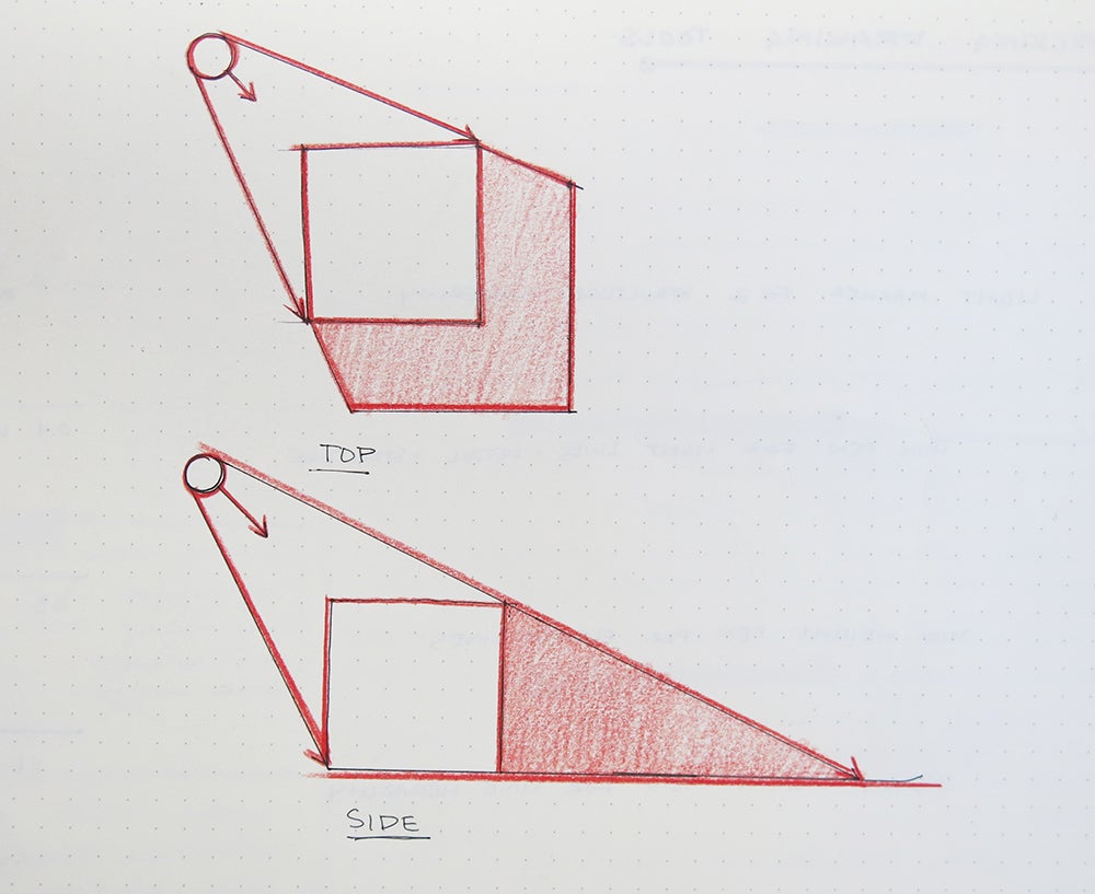
Practice this technique from different angles with cubes and cylinders.
Remember that shadows still follow the rules of perspective and recede to vanishing points.
How does the shape of the shadow change when you move the light source?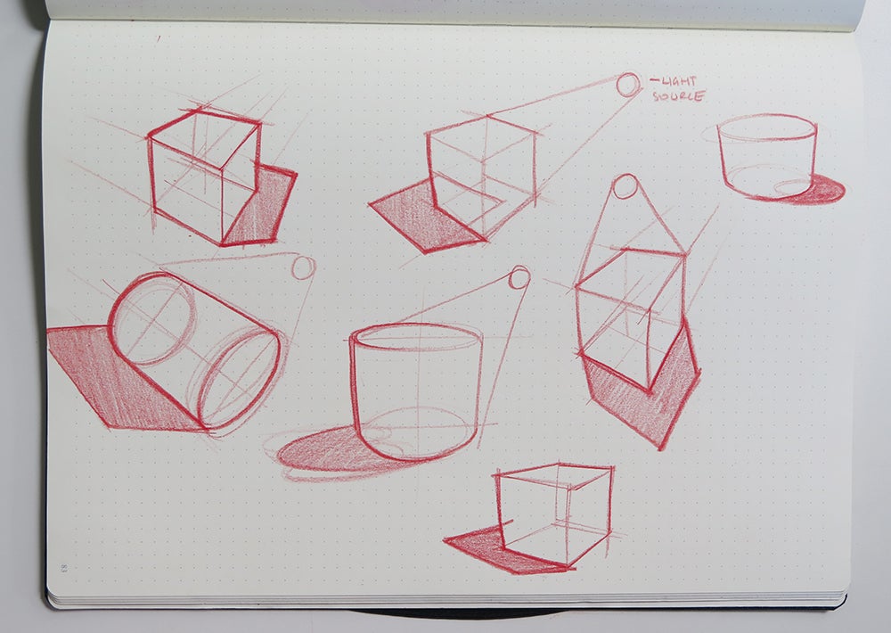
Step 2: Adding Dimension With Line Weight
Shadows help add dimension to a figure, another way to make your drawing pop off the page is by varying your line weight.
Line weight is a simple but powerful tool.
Drawing tools are available in a variety of line weights.
A thicker line weight can be used to imply shadow, ground the figure on the page or give an object visual weight.
Thin line weight and breaks in a line can be applied to give the impression of lighter areas or highlights.
When doing a quick sketch or orthographic drawing (straight on view front, back, sides, etc) I will often skip shadows and instead only use line weight to add dimension.
Varied line weight can also be used to emphasize or de-emphasize certain information on a page.
For example you can let structure lines fall back by using lighter marks to build your drawings and emphasize your final form with a thick line weight.
Or you might want to call out a certain part of your figure like a feature or part. This can be brought into focus by applying a heavier line weight to it than the overall form.
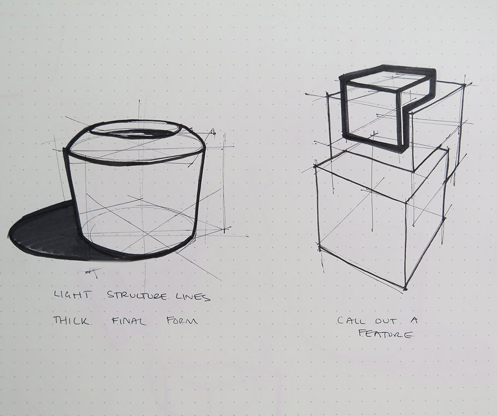
To imply shadows and a light source with line weight consider what edges of your form are in direct contact with the light source. These lines will be drawn with the lightest line weight.
The edges that don't see the light source will be the heaviest line weight.
If you want to add a third mid-line weight apply it to any edges that may see partial light.
On a cube and cylindrical shape it looks like this.


Step 3: Tone
Shading your drawings can also make them appear more realistic and three dimensional.
Apply tones of different value to the faces of a figure to imply shadows, suggest material surfaces or emphasize curves.
Test out your drawing tools and see what kind of tone they can create.
Doubling up marker strokes can be used to create subtle tone variations. (try not to go over move than three or four times while the paper is wet because it might tear or warp)
Hatching pen lines can also create a variety of shapes.
When creating hatch marks focus on keeping your marks parallel and evenly spaced. Avoid placing hatch lines perpendicular to each other. Instead tilt them on a steep angle. This will avoid creating a checkerboard effect.
The tighter your lines make darker tones than wider lines.

Try using these techniques to add tone to the shadow and dark side of a cube.

Step 4: General Rendering Techniques + Tips
Rendering curved surfaces is a bit different than rendering flat surfaces.
Generally speaking flat surfaces can have an even tone applied across them.
Curved surfaces however are a continuous face with no edge breaks for tone changes. This means you must transition the tone from light to dark to give the illusion of a highlight.
These tone strokes are best applied perpendicular the the direction of a curve to ensure even coverage.
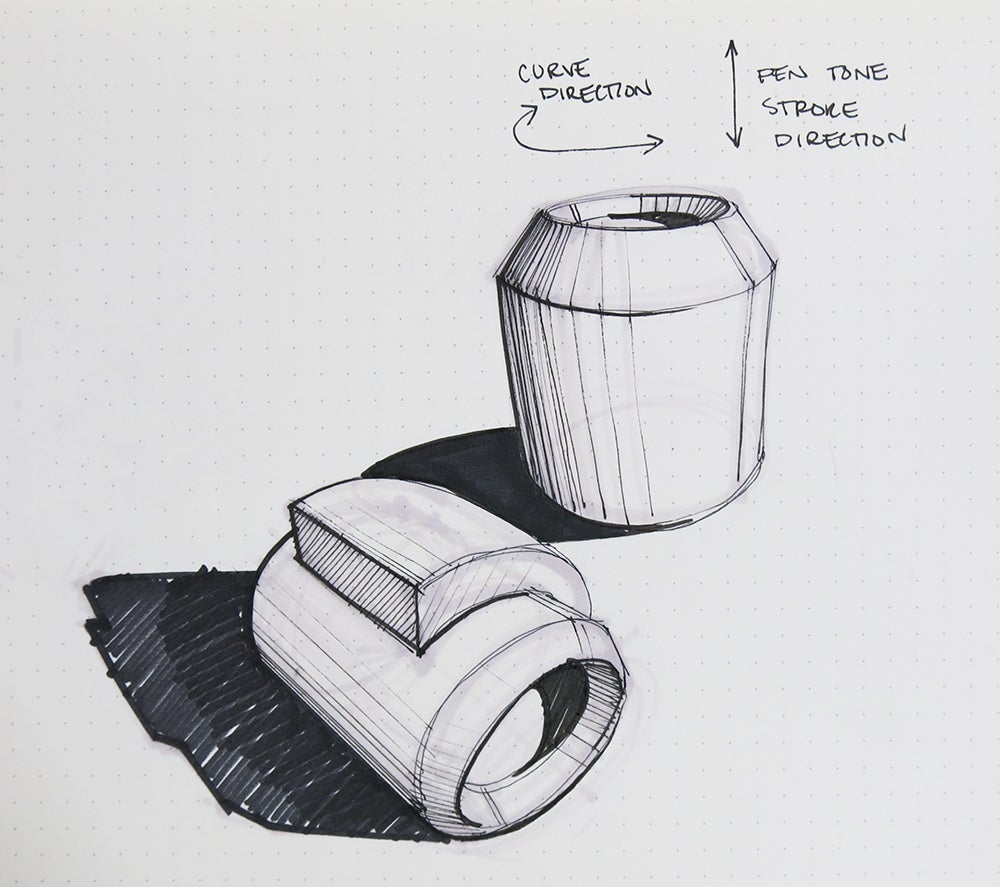
Depending on the type of material you are rendering your tone transitions and highlights will vary. they may be soft and muted, sharp and harsh, or somewhere in between. Soft transitions are best for matte finish materials such as wood, matte plastic, or concrete. Harsh transitions work well to replicate mirrored or glossy finishes like metal or polished surfaces.
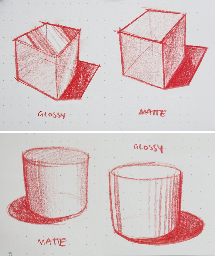
The best way to practice rendering different materials is to find objects in real life (not from a photograph) and draw by observation under different lighting conditions. Stick with simple shapes at first and focus on accuracy not complexity.


