Introduction: Plotting Data Using MATLAB

In this tutorial you will learn how to use the MATLAB program from MathWorks to create a script file that will make a set of data and plot that data. This is a very useful tool in all types of scientific and math based research allowing the user to take experimental data and look create a visual picture of things like position or velocity vs. time, or even fuel economy of a car over some distance.
MATLAB by MathWorks is a computational tool used by many engineers, scientists, and mathematicians to analyse data and present their results in the form of numbers, images, or even video. The program uses matrix algorithms and a unique coding language that allow the user to work with massive systems of equations easily and efficiently. The program also has the power to do numerical evaluations when simple calculus can not be used.
Items needed:
To complete this instructable you will need a computer, and the MATLAB software from MathWorks.
Time:
This task should take between 10 and 15 min to be fully complete.
Step 1: Opening the Program
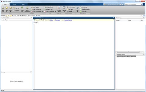
To begin, the computer you are using should be turned on and logged into. From the desktop click on the windows button in the bottom left hand corner (windows versions vista, 7, and 8, start button for previous versions) and search for the program MATLAB. Double click the text "MATLAB R2013a," to open the program. If you do not find the program through the search the computer does not have MATLAB installed and you will need to use a different computer. The program will take a moment to load, but when it does you will see the home window pictured above.
Step 2: Creating a Script File

The easiest way to complete a task in MATLAB is to work in a script file. A script file is a secondary window that allows the user to edit and run a block of code all at one time completing several tasks simultaneously. To open a script file click on the button in the top left corner that says "New Script," (pictured above) for users with older versions of MATLAB this can be done by going to the file tab, selecting new then selecting script. Doing this opens a blank script file in a new window. Note that any commands given in the next several steps must be followed exactly. Any spelling, mis-capitalization, or missing lines will cause the code to crash, so please read the instructions carefully and type the code exactly as it is shown.
Step 3: Beginning a Script File
When first starting a new script file it is important that you do not have any of the variables that are about to be used assigned to another task. In order to prevent this begin any script file with the following:
clear all
This command clears any values that have been assigned to variables.
Also for this particular script you may want to keep the command window on the main window clean. To do this enter the following on the next line your script file:
clc
The "clc" command wipes any previous work from the command window display.
Step 4: Creating or Importing Data
Now that you have the beginnings of a script file its time to get the data. Many times data has already been obtained from an experiment at this point in the process. If you already have data you can import it from another program using the command "importdata('FileName')," this will bring in any data as a matrix and store it to a variable. For this tutorial however, we will be creating our own data. Enter the following command on the next two lines of the script file:
x = [-10:0.5:10];
y = x.^2;
This will create a vector, or a set of numbers, assigned to the variable x that begins at -10 and increments by 0.5 to 10, and assigns a vector of the same length equaling x^2. Note that the semi-colon at the end of each of these lines is optional and functions only to suppress the output of the commands to the command window. If you would like to view the output delete the semi-colons.
Step 5: Creating the Plot
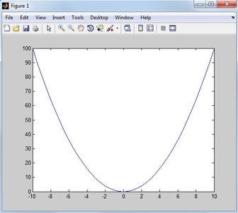
Now that you have created data you can plot it to a graph using the "plot" command. On the next line of the script file enter the following:
plot(x,y)
After this command is entered run the file by either pressing the F5 button on your keyboard or clicking the run button located in the top toolbar almost in the center of the screen. You will be prompted to save the script file, name it "my_first_plot," and save it to the folder. This plots the x-data vs. the y-data to show the change in y over the period x. For this data you should see a classic parabola in the figure 1 window (shown above). If you do not see this in the figure window return to step 3 and check your data entry.
Step 6: Adding Data Markers
Now that you have a plot of the data it is time to clean it up and make it presentable to be used in a report. Note that all of the code in this step is added to your existing code, only add the portion that was not previously typed in your code.
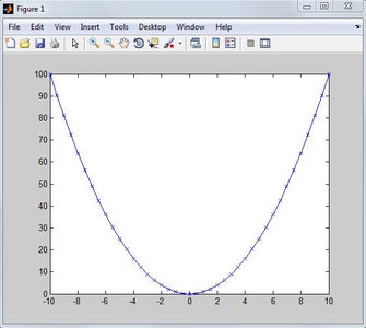
First you want to make sure you have the correct line style for the data. For this plot you want to see not only the curve but also the individual data points, so in the existing plot command add the following bold section:
plot(x,y,'-x')
Run the code again and you will see small x's dotting the curve, indication the raw data points, as is pictured in the image above. The changes have automatically been saved.
Step 7: Adjusting the Marker Size
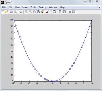
These x's are rather small and hard to see. In order to fix this enter the following addition to the plot command (addition in bold):
plot(x,y,'-x','MarkerSize',10)
Run the script file again. This enlarges the size of the "x" markers making them more visible on the plot as is shown in the above picture.
Step 8: Changing the Plot Color

Although the default blue line and markers are nice, sometimes you want to make the line and markers stand out a bit more. To do this add the following code to your plot command (addition in bold):
plot(x,y,'-x','MarkerSize',10,'Color',[1,0,0])
Run the script file. The line and markers will now plot red. The three numbers in the bracket represent an RGB vector, any color line can be made by manipulating these numbers.
Step 9: Formatting the Plot
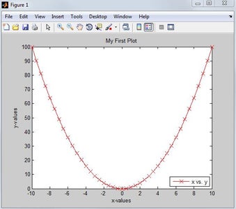
Now that you can see the raw data it is time to add labels and a legend to your plot. Following the plot command on a new line enter the following lines of code:
title('My First Plot')
xlabel('x-values')
ylabel('y-values')
legend('x vs. y','Location','SouthEast')
Run the script file. This has created labels for the axes, given the plot a title, and put a plot legend in the lower right hand corner (thus the 'SouthEast' string). The plot is now complete and ready to be printed and displayed. The Final plot is pictured above, if your plot looks different then please check your code in steps 4-8 or the final code in step 10.
Step 10: Checking Your Code and Debuging
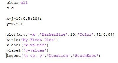
Above i have provided the code that was used to make the final plot from step 8, if for any reason your out put is different from the final plot use this to check your work and debug your own code. Congratulations and happy programming!

Participated in the
Data Visualization Contest