Introduction: Reading Logged Data With Python


As I was analyzing data logged with various instruments, I wasn’t satisfied with the software available to visualize the data.
Either I didn’t have enough tech support to modify the graphs to what I needed or the software had serious limitations such as not allowing to zoom-in to view details or combining different data sets logged with different loggers to compare the measurements.
In the past, I have only used MATLAB to analyze and plot data in the way I needed because it was the only tool that would offer the flexibility that I needed. I could import the data, analyze it, and create customized plots.
However, now I needed an open source free platform so that I can write the code in a way that would make it easier for my team to read the data. While I was making a data logger with Arduino, I discovered that it was possible to plot the data with Python, a language that was completely new to me. I soon found out that Python is very easy to learn and there are multiple resources freely available online with specific instruction and examples.
So I ventured in learning Python, choosing the right platform to run it on and then dive into the code.
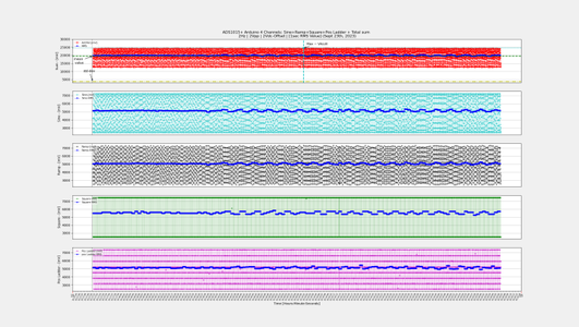
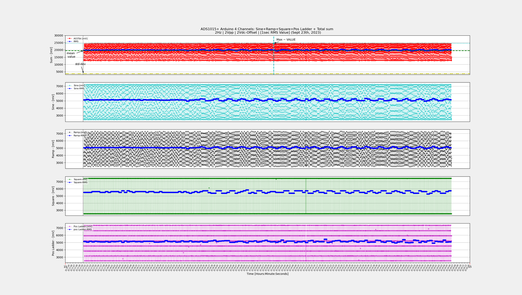
I created a code that not only shows the data recorded in multiple plots, but also compares different recordings and sum them up.
I focused on logging the data with Arduino UNO and using a .csv format with the objective of plotting it with the date and time information for extended periods of time (days or weeks).
My goal is to make a set of projects to analyze power performance of power circuits for extended periods of time. These will be primarily AC and battery powered and will have customized load cycles (AC power will be from a safe source, not with main service to my apartment). For these projects, the cycle times can be in the order of days or weeks.
DataFrame structures allow to process large amounts of data, and Matplotlib provides all the tools to plot the data versus date and time in single or multiple plots.
The Python environment performs all the math calculations, so it’s possible to plot the data with its RMS, mean, median, standard deviation and show the maximum and minimum values.
A very special thank you goes to StackOverflow and all its contributors for sharing their knowledge and providing me with the right tools to complete this code.
Happy reading! Hope you enjoy this Instructables and find it useful.
Supplies
Anaconda with Jupyter Notebook installed on your computer.
I downloaded Anaconda from this link: https://www.anaconda.com/download but you can download it from other sources.
Instructions on how to install it are found at this link: https://docs.anaconda.com/free/anaconda/install/
Step 1: Upload the Code and Open With Jupiter Notebook

After getting the code from here, put it in your folder and then open it with Jupyter Notebook.
Use the test file codes found in my repository as an example to run the code and see how it works. Upload them in a folder (same or other than the Python code’s folder)
Once you open the Python file, you will be able to execute each box of code sequentially.
Each box is commented to explain what the code will do. Any code modifications are possible by simply reading the instructions of each command and choosing the options required for the specific data file that is being analyzed.
Each box will perform a task as described below:
- importing all the libraries that will be used to plot the data
- load the data
- check the uploaded data with the .head() command
- convert the data from bits to mV
- check that the DataFrame has the correct values with the .head() command
- get the DataFrame number of data points with the .count() command (this is needed for step #9 )
- Create the DataFrame that is the sum of all the signals recorded
- The next four boxes have commands that may be needed if you want to save the sum data frame or load a previously created sum data frame. Also you can check the values and count with the .head() and .count() commands.
- Create the date time series that will be used to plot the file. To run this box you will have the .count() information but also the start date-time of the data logged and the distance between samples of the data logged. The latter information should be contained in the header data file being analyzed.
The code boxes following step 9 are to be executed as needed.
To make the code complete, I've included the following calculations needed to analyze my data ( these can be modified depending on the data being analyzed):
● RMS value of the data recorded
● MAX value of the data recorded
● MIN value of the data recorded
● MEAN value of the data recorded
● MEDIAN value of the data recorded
● STANDARD DEVIATION value of the data recorded
The final box plots the data imported and calculated in the previous steps.
Step 2: References - Youtube Channels
I learned all the basics from the following sources freely available on youtube:
- Sentdexhas a complete YouTube course on Matplotlib. I learned all the basics from this course and then refined the code with the help of the sources found on StackOverflow. He also has videos that cover Pandas (the language to setup the DataFrames).
- Data School has a complete YouTube course on Pandas. His videos are clear, straight to the point and provide real life examples. This course was a big help for me.
- StackOverflow: just type your problem and chances are you will find a thread that has a solution. If you don't find it, you can always start a new thread and someone will provide the help you need.
- Another sources are the languages online manuals.


![Tim's Mechanical Spider Leg [LU9685-20CU]](https://content.instructables.com/FFB/5R4I/LVKZ6G6R/FFB5R4ILVKZ6G6R.png?auto=webp&crop=1.2%3A1&frame=1&width=306)